We look at three of the latest in templating frameworks and page builders – Divi Builder, Elementor, and Oxygen.
This article is primarily for web site owners, just taking over their new site created by a web designer in the WordPress CMS (content management system). However, designers may also find it useful when deciding how to build their next project.
Our overall aim is for the handover-takeover phase to go smoothly, and this depends greatly on how usable the site is for the owner to maintain and add content to. Build cost is also a factor, of course, in terms of design hours.
Grab a cuppa and read on, or if you like watch the video screen cast.
Designers these days are using a variety of tools to construct the final product, and some of these tools are “visual” or “drag-and-drop”, meaning that we no longer need to mess about with PHP/HTML/CSS code.
In particular we no longer need to design templates in PHP, which is really difficult and time consuming. This translates to far less expense in terms of design hours.
My priorities are usability, functionality, and flexibility as listed below:
- Ease of use by the owner.
- Ease of use by the designer.
- Functionality.
- Design flexibility.
- Visual impact and appearance.
Placing visual impact and appearance lowest in priority may alarm my prospective clients, but by the end of the design and handover process we are usually in furious agreement about this. In any case, the final appearance of a web site these days is pretty darn good. The point though is that you really need to get the other aspects sorted first.
If you don’t, then the final visual appearance is either awful, or the web site doesn’t actually work, or the owner can’t do anything with it. It’s all got to come together.
Note: for this article I refer to posts, pages, products, etc, simply as “pages” – each being a display of one type of information. I also refer to “archives” which are collections of items within a type displayed at the same time. These types are called taxonomies. So for example your blog page is an archive of posts, and your shop page is an archive of products.
WordPress Editor
Let’s start with the normal WordPress editor. People are usually at least somewhat familiar with this, and it usually results in complaints about the limited formatting capabilities.
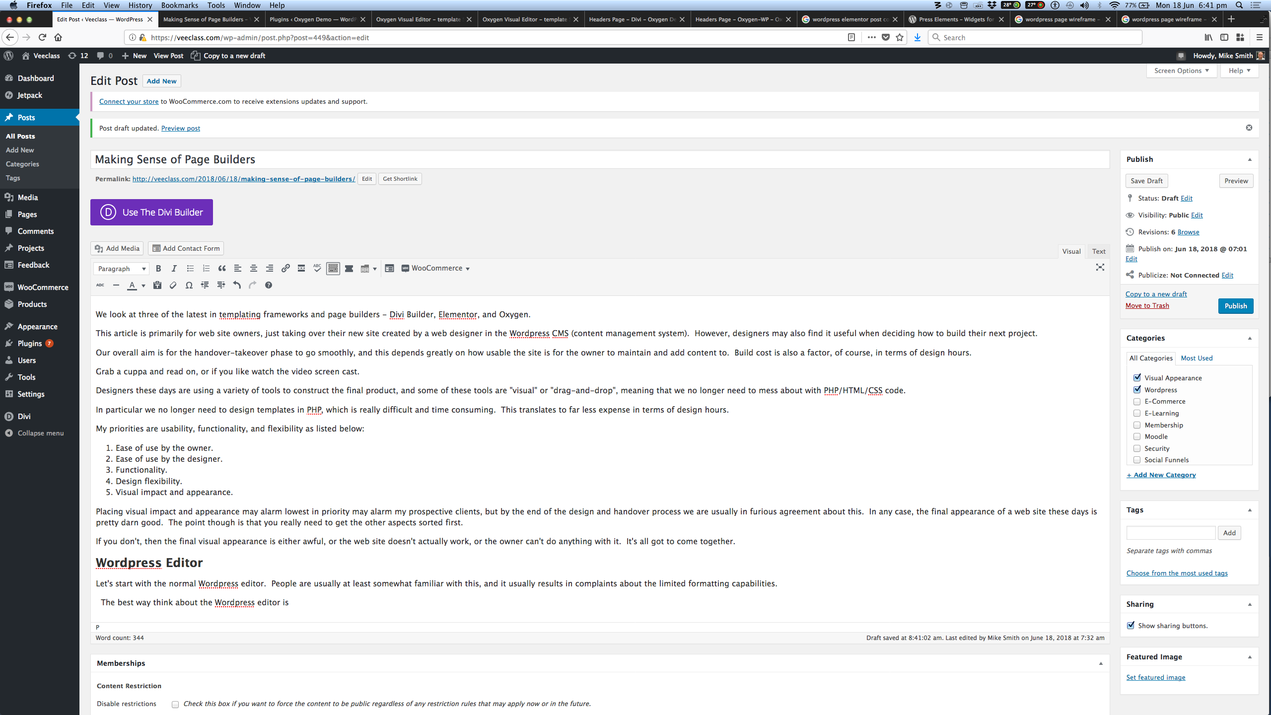
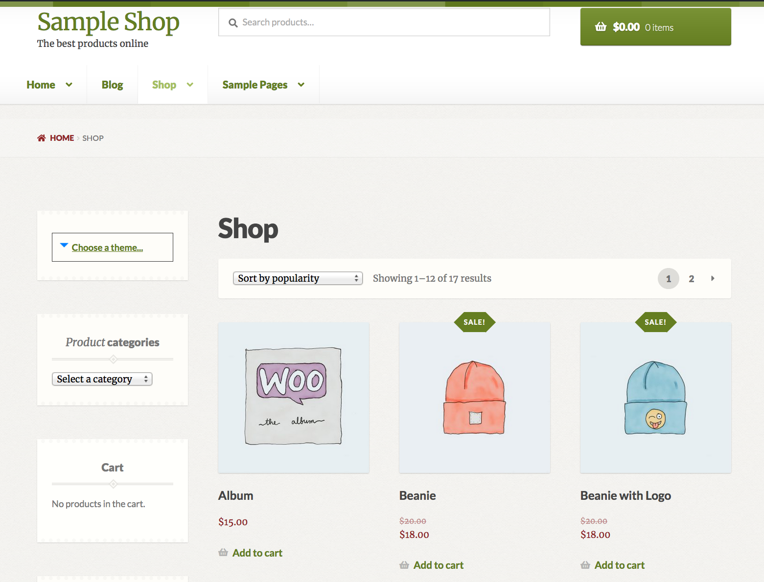
The best way think about the WordPress editor is not as an editor at all. You are not editing a page at all. You are simply entering data (text and images) into the underlying database. The theme sorts out the page layout and formatting. For example, here is an archive of shop items. The colours, layout, fonts, etc, are controlled by the theme, which pulls the text and images out of the database.
Here is the page for just one of these products, the Woo Album:
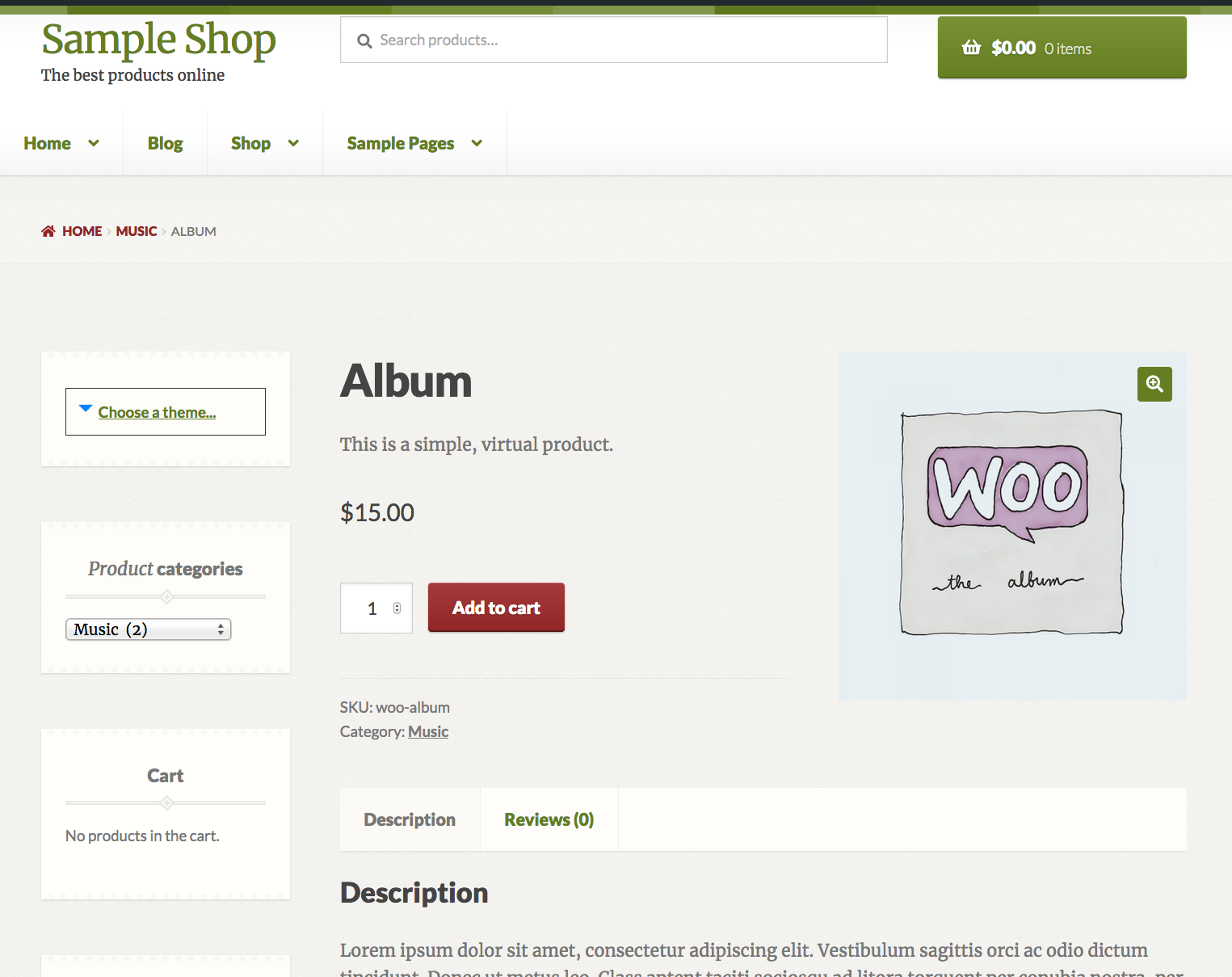
Here is the editor for this product:

Viewing a product instead of an ordinary page/post helps clarify how distant we are from the idea of “editing a page layout.”
However sometimes we really do want to format a page carefully. One example would be a site’s home page – the first page a visitor would usually see. Another example is the various types of landing pages designed as the destinations for marketing funnels.
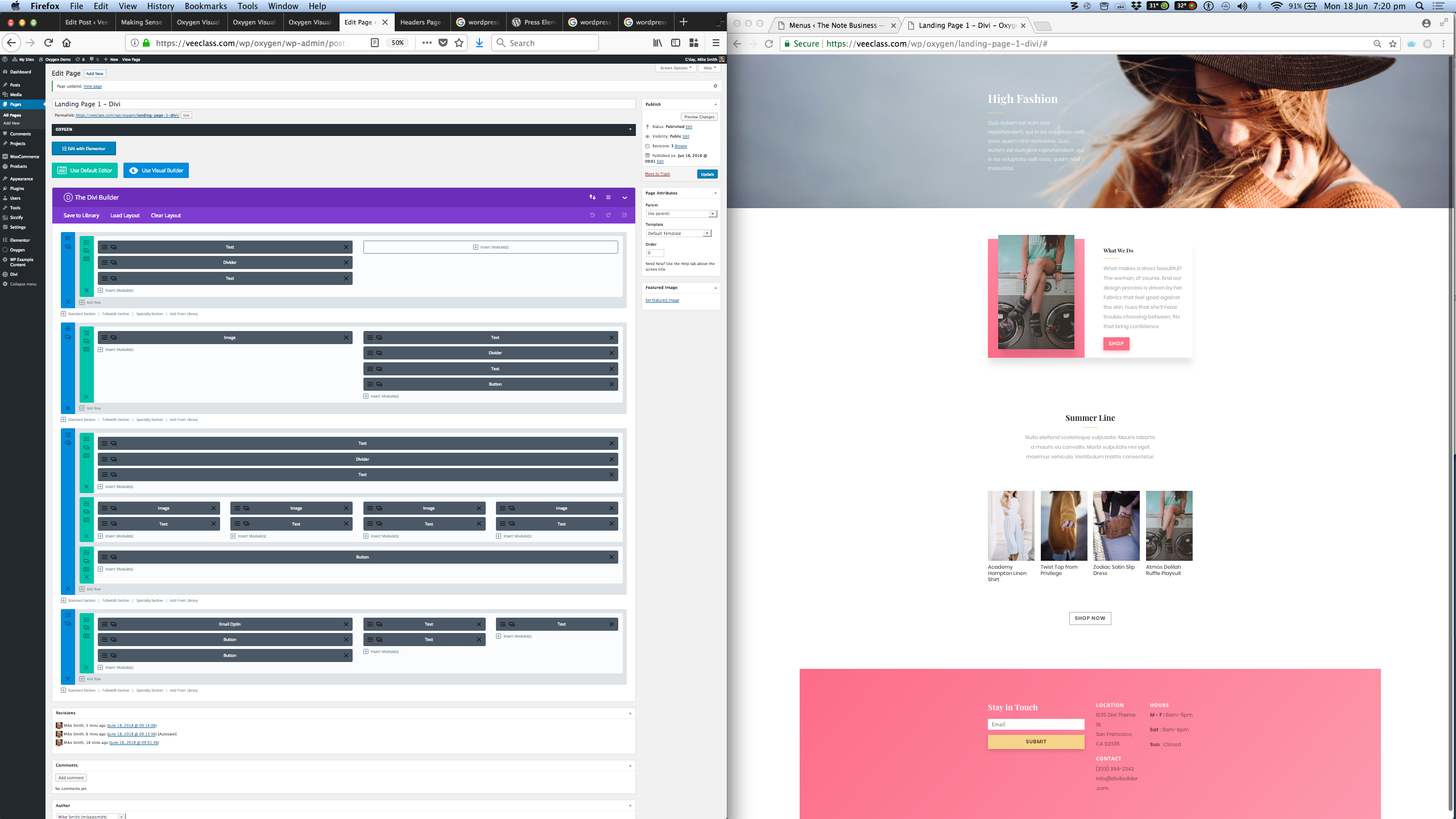
Here are some example layouts for a Fashion Site that ships with Divi Builder:
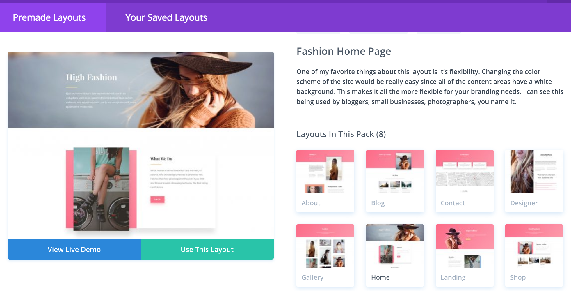
If we were to build these as normal WordPress page templates (in PHP code), it would be a lot of hard work and tweaking them would also be hard – almost a practical impossibility for the owner after the web designer has handed over. This is why Page Builders such as Divi, Elementor, Visual Composer, etc, have become popular.
These make custom layouts easier, but they bring some consequences for usability… as we shall now see.
Divi Page Builder
Made by Elegant Themes, the Divi Builder evolved from the Divi Theme which was one of the first visual page builders to gain popularity among the WordPress community. Earlier pioneers included Thesis and Genesis, but Divi really opened up new possibilities for visual design. Suddenly web sites had cool transitions, animations, flexible layouts, parallax backgrounds, one-page designs, as well as truly beautiful home pages and effective marketing landing pages.
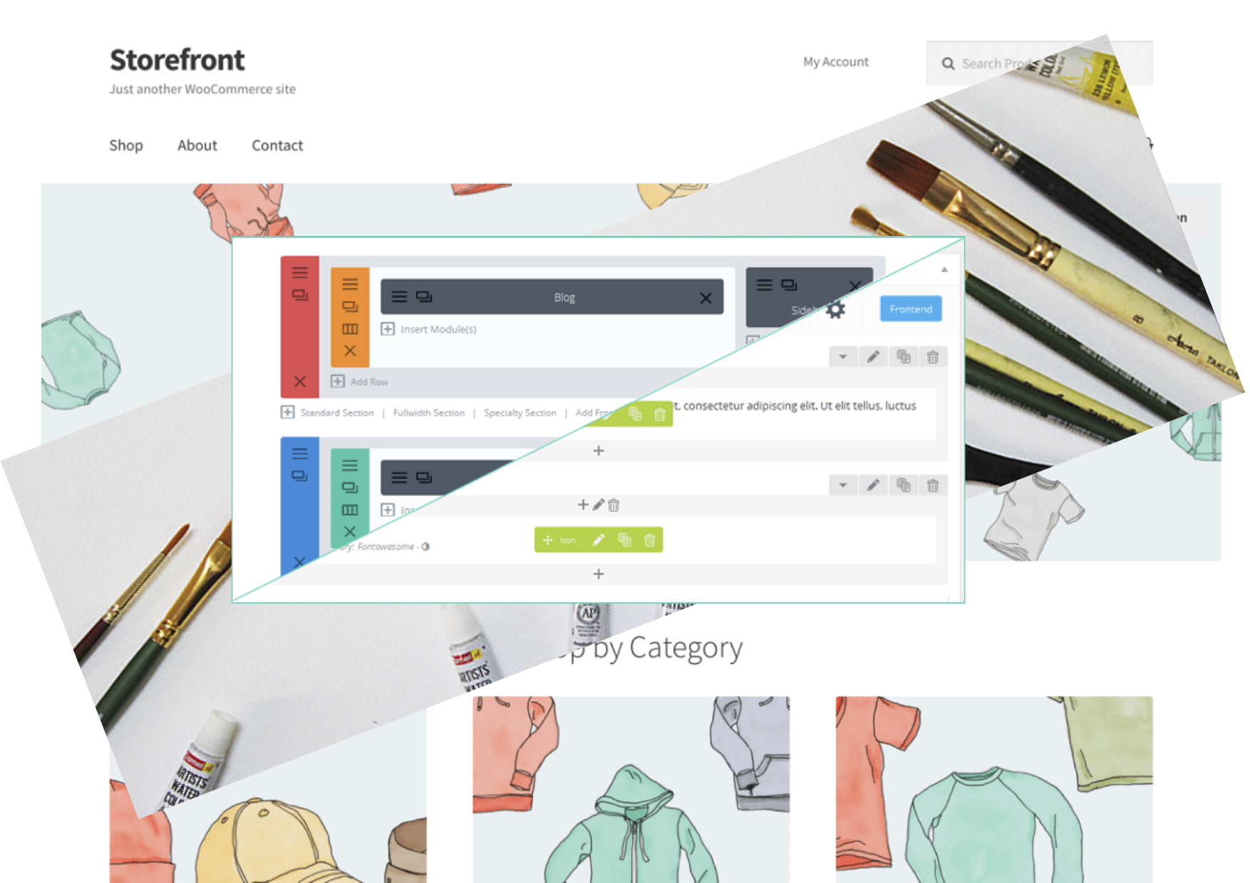
Elegant Themes understood that their idea of a page builder was popular but not everyone wanted to use the full Divi theme. People had invested in their own themes. So, ET released the Divi Builder as a general plugin (for the price of a subscription). Used within another theme, the above fashion page would site within the framework of the existing theme. So the Header and Footer would sit above and below the Divi Builder-generated content, as illustrated below:

When designers wanted to cover the whole page with the Divi Builder content, they needed a blank template for that page – relatively easy to achieve as shown below on the right. So, the design problem was solved. The only problem was the confusion left for the owner, as also shown below on the left.

Clearly, the editor does not now resemble the boring-yet-familiar WordPress editor. Viewed side-by-side with the output, the structure makes more sense, and recently Divi added an onscreen editor called Visual Builder. The following screen shots give a sense of how that works.

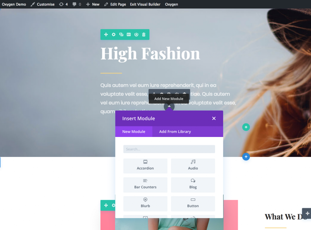
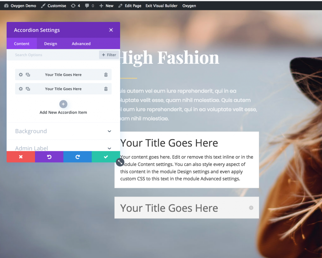
The onscreen Divi Visual Builder is great for some aspects – especially if working on a single laptop screen, but I still think that the side-by-side display on a large monitor is the most effective work flow. That brings us to Elementor.
Elementor Page Builder
Elementor came to my attention more recently and it has quite incredible support from the WordPress Plugin community. Extra functions to achieve almost anything are possible. The gallery below shows some of the template layouts available for free and as part of the premium (Pro) version, as well as some of the free plugin support available, many of which have extended premium versions.


The Elementor Editor is a side-by-side arrangement, which I think is efficient, and properties are accessed while the element is visible as shown below:


Editor Confusion
In addition to being new interfaces in themselves, the Divi and Elementor page builders both cause some confusion for the web site owner on the initial editor screen as well, as shown below. It is very easy to accidentally trash the whole page by selecting the wrong editor. This example is a bit extreme because I have two page builders going, plus Oxygen which is discussed next.

Oxygen Theme Framework and Page Builder
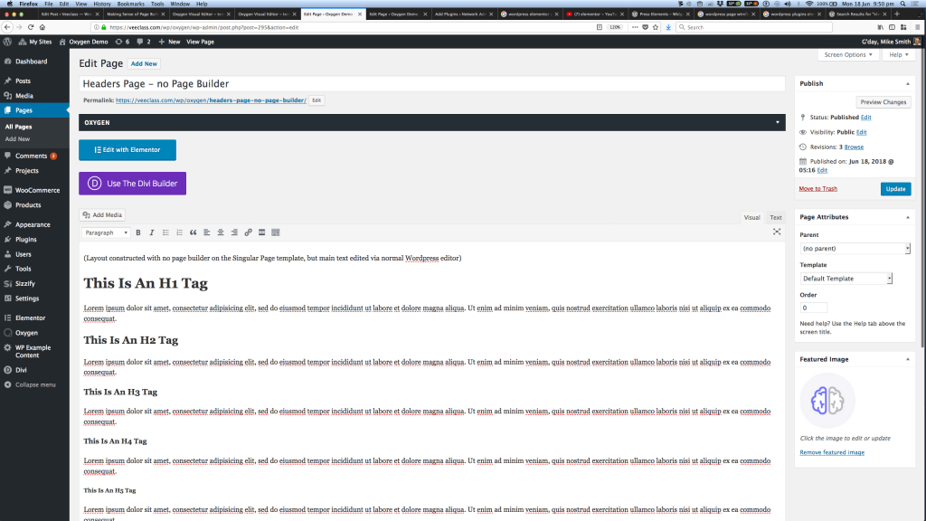
Oxygen is a relatively new theme framework which takes the original Thesis evolution through to Divi/Elementor, to a whole new level. Oxygen provides the web designer control over every aspect of theme design right down to code level, but in a visually efficient interface. So it can design page templates rapidly, effectively, and efficiently. At the same time it makes available direct access to the WordPress database contents, meaning that once a page template has been defined, the web site owner/author can simply use the standard WordPress editor to add content. This is a step up in usability for the owner while maintaining ultimate flexibility for the designer.
One thing to note is that not any ordinary web designer will feel comfortable using Oxygen, particularly those who have only ever used the tools such as Divi/Elementor that have become popular in the last few years. Oxygen takes the designer back to advanced CSS at the very least, and PHP/Javascript to really get things done. Oxygen rewards those designers with that depth of knowledge.
An example of the Oxygen page layout designer is shown below. The Page Title and Page Content, as well as the Featured Image are drawn from the database and edited via the normal WordPress editor.


Demonstration Videos
Below are videos giving overviews of Divi, Elementor, and Oxygen.
My Screencast
Below is my screen cast covering this article. I hope you found them useful.